Designers and A&Rs for Lil Yachty, Young Thug, 6lack, Kodak Black, Odd Future, and more weigh in on the importance of cover art in 2017.
I keep thinking about something Kanye West tweeted in early 2016.
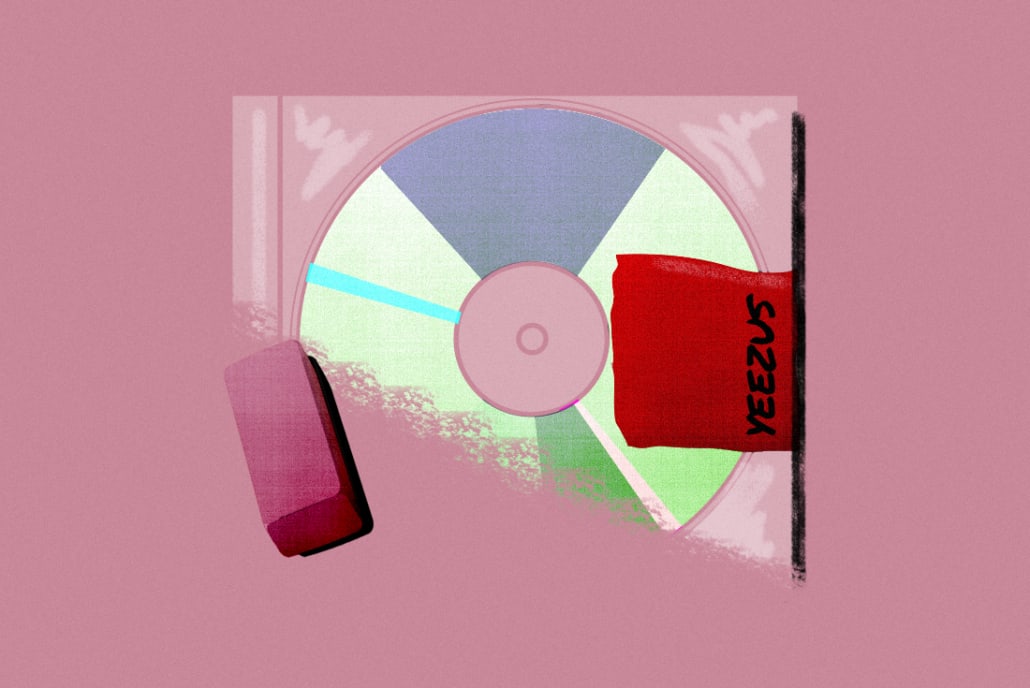
“The Yeezus album packaging was an open casket to CDs.”
Marked with nothing but a small piece of red tape over a jewel CD case, Yeezus‘ blank artwork was a fitting cover for a minimalist album. But on a larger level, it acknowledged the looming death of physical music—and helped started a conversation about the role album artwork will have as streaming replaces the idea of owning music.
Four years after Yeezus‘ release, while staring at a grainy digital photo on SoundCloud that serves as the “artwork” for XXXTENTACION’s massively successful “Look At Me!” single, I wonder what value cover art still holds.
In many ways, artwork has been reduced to a formality. Services like SoundCloud and Spotify still require artists to upload some form of cover art along with their music—so it lives on for now, but its purpose is changing.
In 2017, artwork appears as small thumbnails on digital screens far more often than on actual physical album covers. 80 years after a graphic designer at Columbia Records invented album art as a way to help sell vinyl in record stores, its original function is becoming a thing of the past. So, it’s worth asking: Does cover art still matter? Is Lil Yachty the only one who still cares?
With these questions bouncing around my head, I asked musicians, visual artists, creative directors, writers, and A&Rs around the industry for their opinions on the changing art form—and learned that cover art might actually be more important than ever.
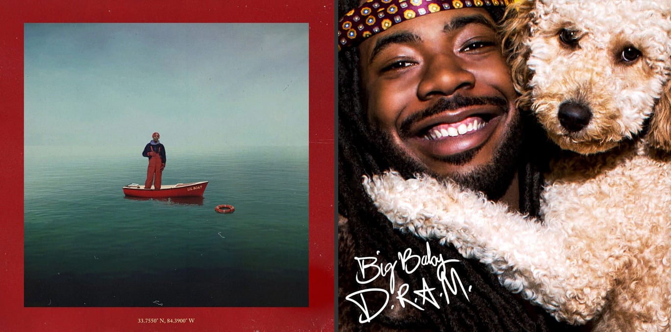
“A lot of times cover art is the consumer’s first interaction with an artist’s work,” D.R.A.M.’s creative director Sais tells me. “In the past a person would go to a record store, see an unknown artist and make a decision whether they would give it a chance. That time might be two to five seconds. With the internet there are more chances where that visual connection can be made.”
For decades, cover artwork’s main purpose was to compete for attention with other albums on the same rack at the record store. Now, that rack has been replaced by social media timelines. Not only does an album’s art have to compete with other covers in 2017, it has to stand out next to memes, family photos, cat videos, and everything else vying for attention on crowded timelines.
MAKING SOMETHING THAT’S GOING TO CATCH PEOPLE’S EYES WITHIN SECONDS IS IMPORTANT. PEOPLE ONLY HAVE THAT AMOUNT OF TIME TO BE INSTANTLY ATTACHED TO WHAT YOU CREATE.—MIHAILO ANDIC
“We’re in a time right now where our attention spans are really low,” Mihailo Andic (designer of covers for Lil Yachty, Gallant, Fetty Wap, and 6lack) explains. “We process information a lot faster and we process music a lot faster. Making something that’s going to catch people’s eyes within seconds is important. People only have that amount of time to be instantly attached to what you create. And you have to either grab their attention or you lose them right away.”
Seeing this firsthand with the success of Lil Yachty’s playful cover for his Lil Boat mixtape, Andic adds, “I think that is something that we’ve really captured well with Yachty. People immediately felt the connection with that visual and they could sense that there was a big idea behind it.”
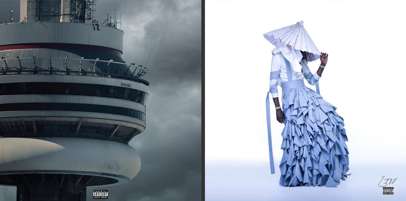
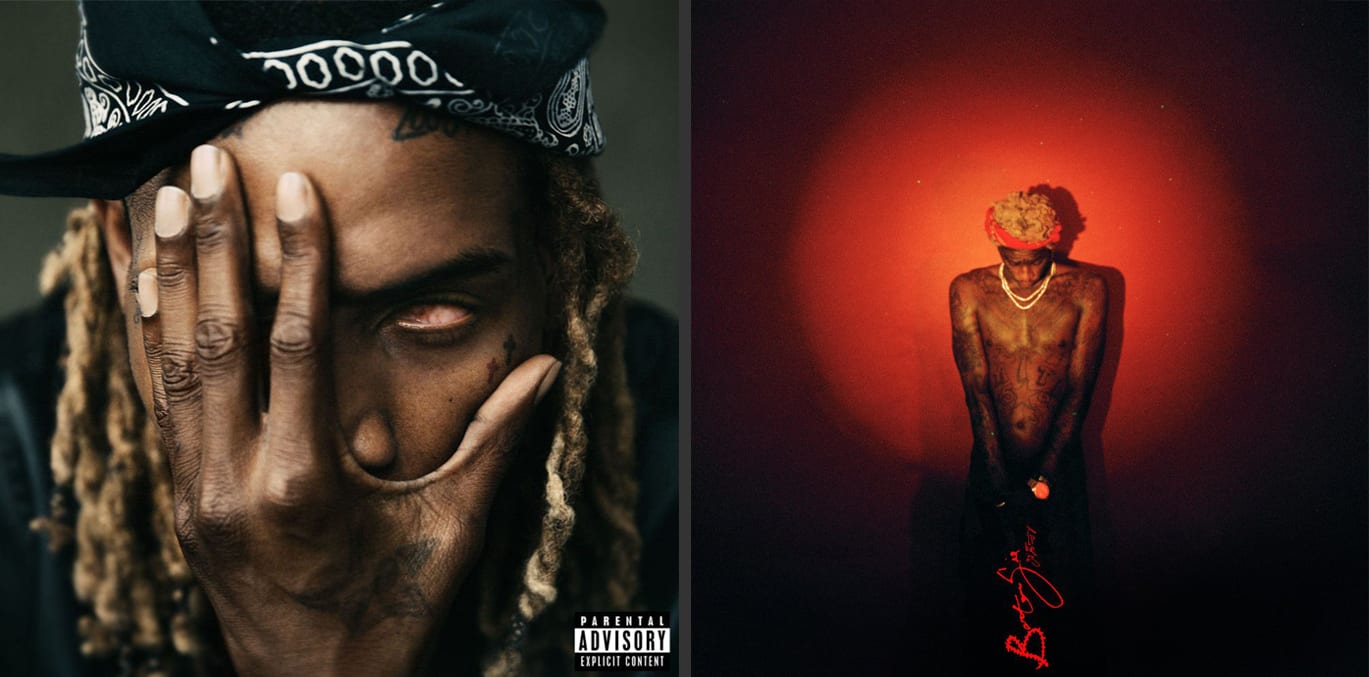
Once an emotional connection is made with fans, artwork can take on a life of its own and live outside a musicians’ own fan base. Artists like Drake have been able to tap into meme culture with viral artwork like the “Tiny Drake” Views cover. Others are able to start conversations that stray far outside their own fan bases with bold imagery like Young Thug’s dress-wearing Jeffery cover.
The social, share-friendly nature of the internet can help an interesting cover grow wings and reach more eyes than it ever could sitting on a rack.
“Good work will always be shared,” creative director Steve-O (D.R.A.M. Big K.R.I.T., KAMAU) says. “Young Thug’s album artwork didn’t become a meme sensation but everybody was talking about it. That cover was about Young Thug pushing the envelope but being himself.” Noting that the music is spread along with the artwork, he adds, “If the song is shared, the art is shared.”
In an era where a rapper like Lil Yachty openly admits to “thinking more like a brand” than an artist, developing a strong visual identity is more important than ever. It’s a chance for musicians to create unique worlds for their fans to live in—and become personally invested in.
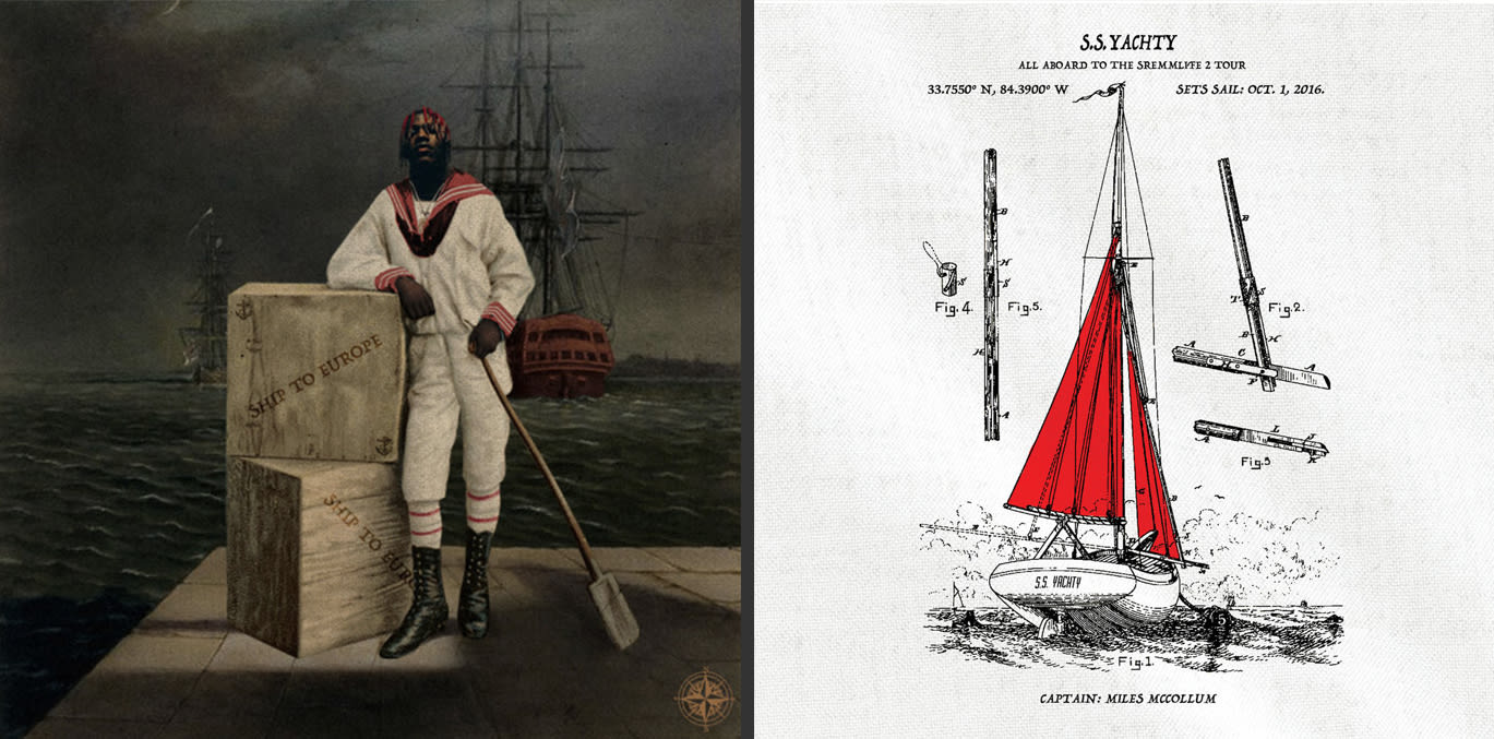
“The whole brand that we built in the last year, it’s definitely its own little world,” Andic says about his experience building Lil Yachty’s visual brand in 2016.
“Within that world, we have something where fans can feel like they’re a part of that community,” he continues. “They’re going to remember that. You’re giving them an experience and they’re going to take that away with them and they’re going to keep coming back for more. They’re going to tell their friends about it. They’re going to spread the music. Once they’re buying in to you, you have a loyal fan base that’s going to stick with you.”
A strong visual identity gives fans something tangible to grasp onto during a time when most music consumption happens digitally. A fan with a Spotify subscription doesn’t need to buy records, but they might choose to if they have an emotional attachment to the cover art and want a physical memento of their favorite artist. It’s a chance for fans to hold a piece of their favorite artist’s world in their hands.
WHEN KIDS BOUGHT ODD FUTURE MERCH, THEY WEREN’T JUST BUYING THE GARMENTS, THEY WERE BUYING INTO THE LIFESTYLE.—CHRIS BURNETT
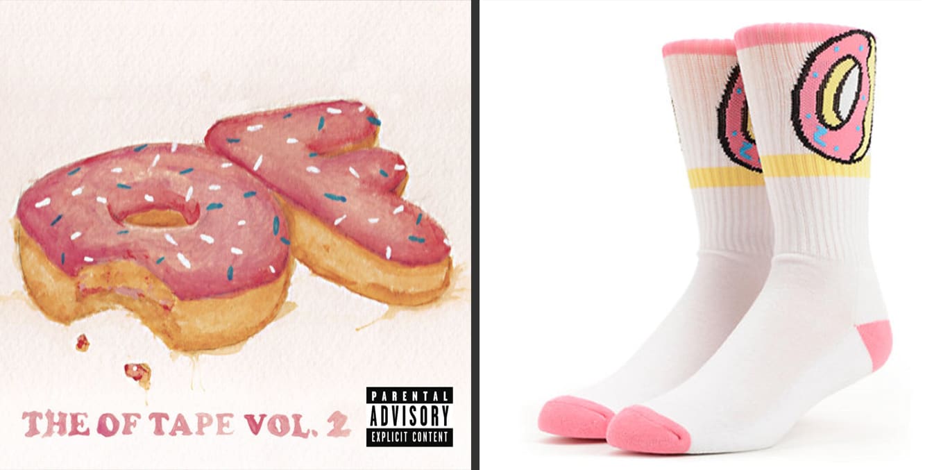
A cover concept can also act as the starting point for other visuals (and merch ideas). It’s no accident that an aesthetically minded artist like Tyler, The Creator is able to grow a cult-like following that buys Odd Future-branded socks just as obsessively as they snatch up his records.
“When kids bought Odd Future merch, they weren’t just buying the garments, they were buying into the lifestyle,” former Odd Future graphic designer Chris Burnett explains. “At the end of the day, most kids want some sort of hero and that’s why OF had the impact it did. When they see someone like Tyler—who said himself that he was considered a weirdo—out here killing it, they are bound to support. If OF had come about just as a brand—without the music, without the videos, without the homies—it probably wouldn’t have done as well.”
An album cover is an artist’s best opportunity to distill their whole brand into a single image that will follow them for years and become a part of their brand itself.
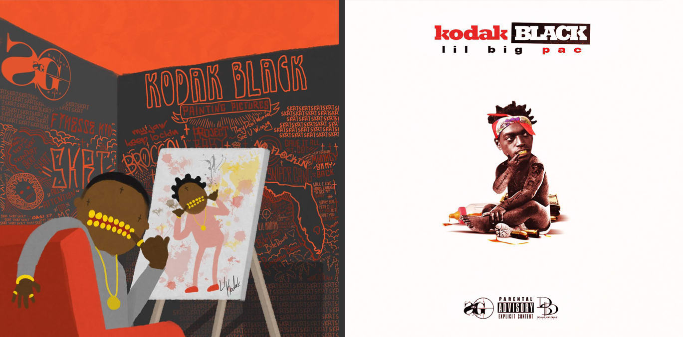
“Everything that’s on [Kodak Black’s Painting Pictures] cover is something that he’s said in a record, you’ve seen in a video, he’s given you in a visual,” Kodak’s product manager Marsha St. Hubert (Senior VP of Marketing at Atlantic Records) explains. “That’s an example of an artist who really knows themselves and really has built their brand.”
Great artwork and a cohesive visual identity isn’t only important for developing a fan base. It can also help artists catch the eye of important industry figures like press and A&Rs who weed through hundreds of music submissions a day. A strong visual can be an easy way to tell how serious an artist is about their craft before dedicating time to dive into the music itself.
“If an artist doesn’t have good artwork/visuals, it certainly deters my interest level,” Complex editor Zach Frydenlund explains. “At the end of the day, only the music matters, but an artist having good artwork goes a long way in getting me to even get to their music.”
“It’s always about the music, but having a strong sense of visual identity is part of being an artist,” says Zeke Hirschberg, A&R at 300 Entertainment (Young Thug, Fetty Wap, more) adds. “It’s part of being an entrepreneur. Being an artist in 2016, it’s about having a full package. So we definitely love to see artists that are focused on the visual as well as the music.”
Hirschberg continues, “We don’t really look to sign artists, we look to partner with entrepreneurs. Because everybody is making their own marketing decisions: whether it’s cover art, video decisions, or A&R decisions. All these kids are so talented. They’re sitting in their bedroom and they’re able to get on to my screen, which is an immensely powerful thing.”
AT NO POINT DO WE SIT DOWN AND SAY, ‘THUG, YOU NEED TO PUT ON A DRESS.’ THAT’S WHY YOUNG THUG IS WHO HE IS AND THAT’S WHY 300 IS WHO WE ARE.—ZEKE HIRSCHBERG
Once the artist is signed, the work isn’t over, however. Now more than ever, labels expect artists to be in command of their own brand and make visual decisions that reflect their unique personalities.
Hubert tells me how impressed she was with Kodak Black’s knack for developing a unique personal brand: “From the moment I met him, he had his own personality, his own vision, his own voice. When he recently came home, he just decided: ‘I’m only wearing orange. Orange is my color. That’s it. Everything’s going to be orange. That’s my color now. I like the way it looks on my skin. It looks good with my golds. I’m wearing orange.'”
Reflecting on his experience with Young Thug, Hirschberg remembers, “At no point do we sit down and say, ‘Thug, you need to put on a dress.’ That’s why Young Thug is who he is and that’s why 300 is who we are. We’re partners and we’re here to facilitate your vision, not create the vision. It’s a conversation. It’s not a label pushing anything. It’s Thug saying ‘this is my vision’ and us using our experience to position it in a way that’ll get the most eyeballs possible.”
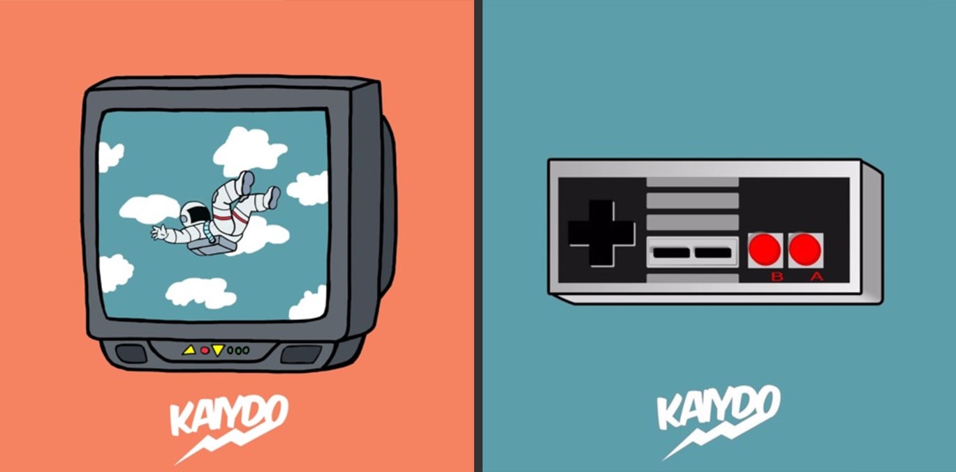
Young artists like Florida rapper Kaiydo are finding out firsthand how excellent visuals can jumpstart a new career.
“I think visuals first,” Kaiydo says of his unique process. “I start off with a concept and an image. So, I’ll come up with either a word or I’ll make random cover art that gives way to an idea. And then I write the song and everything. I try to make sure every song has a really cohesive concept.”
WITH THE WAY THESE KIDS USE PHOTOSHOP AND ALL THAT, THERE’S REALLY NO EXCUSE NOT TO HAVE A+ VISUALS.—ZACH FRYDENLUND
Having created covers for other rappers before ever starting his own music career, Kaiydo had an advantage over artists who made do with sloppy artwork as they presented themselves to the world for the first time. Every song he’s ever put out is accompanied by clean visuals, giving the impression of a seasoned artist from day one. Judging by the consistently high play counts on his SoundCloud page, the strategy appears to be working.
To industry professionals like Frydenlund, there’s no reason an artist should approach their career any other way: “Even if you’re not a major artist, you can still manage to have some dope ass artwork for a project or song. With the way these kids use Photoshop and all that, there’s really no excuse not to have A+ visuals.”
“With the change from physical music to digital, the ability to just upload the song simplifies the distribution,” Kaiydo adds. “You can just upload the song and be done. I think it needs to be a more thought out process of how it will look in all situations.”
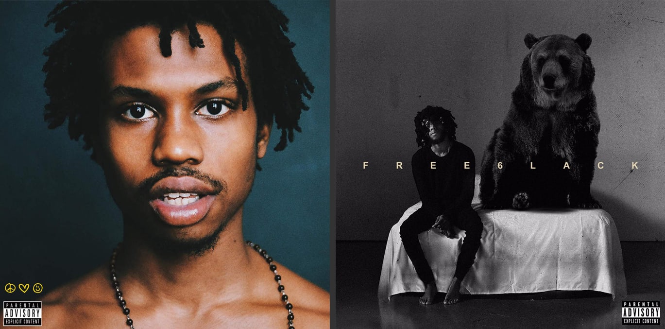
Love Renaissance creative director Carlon Ramong has experience with artists who came out of the gate with unique, professional artwork that helped propel their successful careers—Raury and 6lack. And he remembers how much emphasis they put on visuals from the very beginning.
“Everything from our perspective had to be perfect the first time,” he tells me about the months leading up to Raury’s introduction to the world back in 2014. “It was like, ‘This is going to be the only time we’ll be able to do this, so if this doesn’t work, we’re going back to working in a restaurant again.’”
As I speak with experts across the industry, it becomes clear: Like everything else about the music business, the role of cover art is evolving rapidly. A lot has changed since a designer at Columbia drew on a record sleeve 80 years ago.
Kanye was right. Streaming is taking over and his open casket to CDs was right on time. But it doesn’t makes sense to think of cover art as a form of packaging any more. It’s a way to make music special. It can help turn a collection of sounds into an experience. And on increasingly cluttered timelines, it’s a way to stand out from the crowd.
“Because there’s so much shit out there, all you can try to do at this point is make people want to come to you—so you’re not always chasing,” Ramong puts it. “That’s why it’s so important for every aspect of your visuals and every aspect of your brand to be something enthralling.”


